
What Should a Landing Page Video Include?
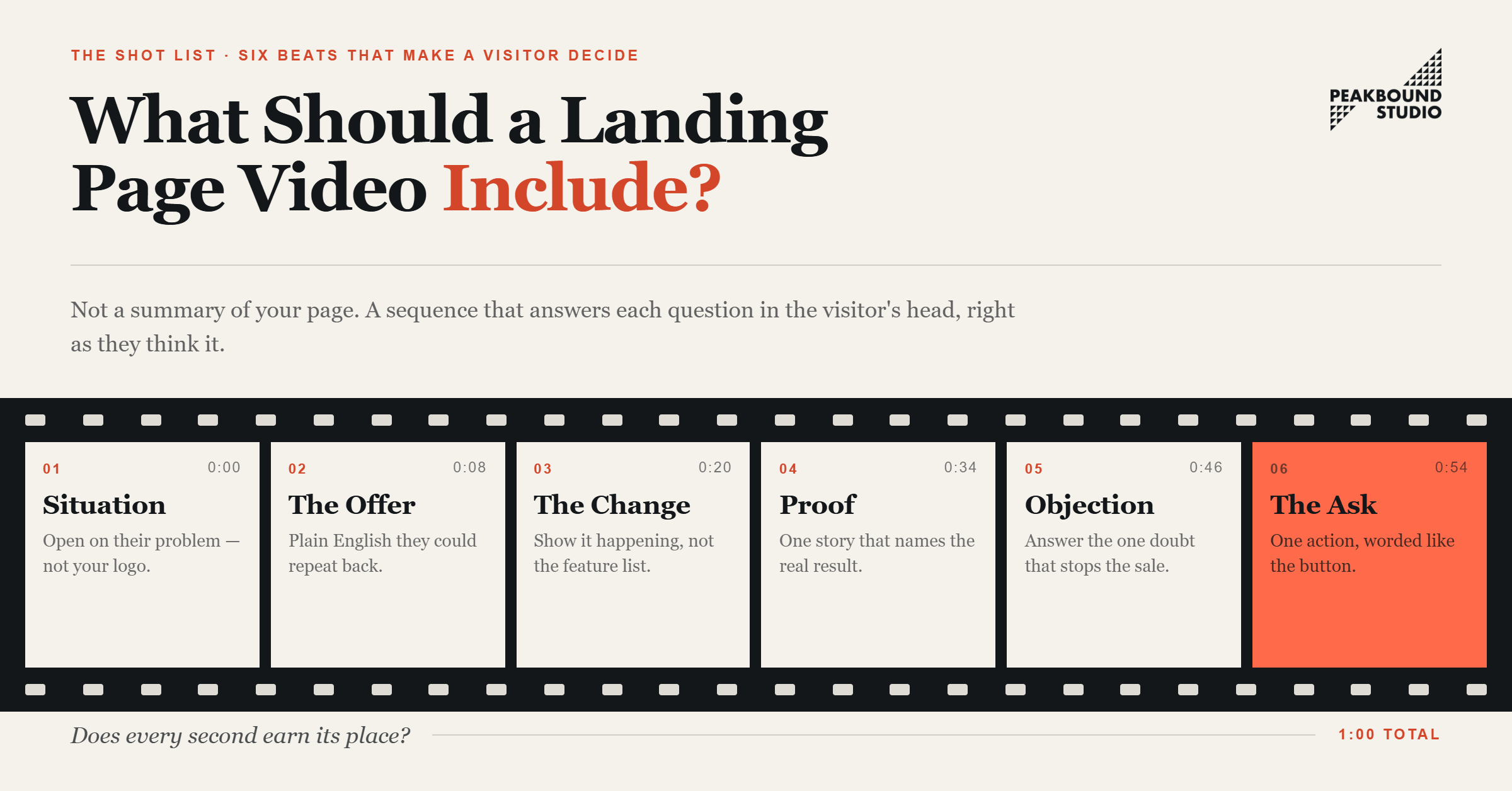
Image credit: Peakbound.studio
TL;DR
A landing page video should help someone decide. It shouldn't just give them something to watch. It needs a few things, in the right order. A relevant opening. A clear offer. Some visual proof.
One good reason to trust you. An answer to the visitor's biggest worry. And a specific call-to-action. Why does order matter? Each part should answer the next question in your visitor's head, right as they're thinking it.
That's also why your video shouldn't just repeat your page word for word. Your page gives people room to scan and compare. Your video has a different job. Make the offer click. Make the next step obvious.
Start With the Visitor's Situation
The opening needs to make the right person feel seen. And it has to happen fast, within the first few seconds. So skip the logo animation. Skip the long company intro, too. Start with the problem or the outcome that brought this person to your page.
A booking platform might open with, "Still losing customers because they can't book after hours?" A contractor could lead with, "Tired of waiting days just to get a repair scheduled?"
Why do these openings work so well? They meet the visitor right where they already are. Your first visual should back up that same idea. Show the problem in action. Or show the result someone wants. Or just have a real person talk straight to camera. By the time your logo shows up, the viewer should already know why this video matters to them.
Explain the Offer in Plain English
Once you've earned attention, explain your offer. Who is it for? What does it actually do for them? Keep it simple. Simple enough that the viewer could repeat it back in one sentence. "We help independent clinics manage bookings, reminders, and cancellations from one dashboard." That says a lot. Compare it to "We provide an innovative solution for better customer experiences." That says nothing at all.
This isn't the place to list every feature you've got. Pick the part of your offer that matters most to a first-time visitor. Then show exactly how it changes their day. Plain language builds trust fast. Nobody has to stop and decode a vague marketing phrase before deciding whether to keep watching.
Show the Change, Not Just the Feature
A feature tells people what your product has. A good demo shows what gets easier once they have it. So don't just say your platform "sends automated reminders." Show it happening instead.
An appointment gets booked. The reminder goes out on its own. A home service company could show the mess before the job, one key moment mid-repair, then the finished result.
This part can be short. Fifteen focused seconds of real use often says more than a long voiceover ever could. Why? The viewer can picture what it'll feel like to buy or hire you. If your offer is hard to film, a simple animation or screen recording works fine too. Just make sure it shows the process, not just decorates the video.
Use Proof That Answers a Real Doubt
Social proof only works when it backs up the exact promise you just made. A generic five-star review looks nice. But it doesn't do much. A short customer story that names the original problem, and the real result, carries a lot more weight.
Something like this works well: "Our front desk used to spend hours confirming appointments. Now most of that happens on its own." That gives the viewer a situation they'll recognize right away.
A short customer testimonial video works especially well when trust is what's holding someone back. Here's a tip, too: the speaker doesn't need to sound polished.
Natural pauses and everyday wording often make the whole thing feel more believable, not less. No testimonial ready yet? Use another specific signal instead. A before-and-after. A client logo. A certification. A real number tied to your offer.
Answer the Objection Most Likely to Stop the Sale
A lot of landing page videos talk up the offer. But they dodge the one question the visitor is actually stuck on. That question might be about price, setup time, risk, or whether this fits a business their size. Answer one real concern, and your video becomes genuinely useful. It helps someone decide, instead of just asking them to take your word for it.
A software company might explain that their product connects with tools the customer already uses. A local service provider could promise a written quote before any work starts.
You don't need to answer every objection here. Just pick the one most likely to stop a good-fit visitor. Leave the rest for your page copy, your FAQ, or the sales call.
Make the Message Work Without Sound
A lot of your visitors will watch this on a phone. Maybe in public. Maybe with the sound off entirely. So captions need to be accurate and easy to read, right from the start. Your visuals should also carry the story on their own, without leaning on narration to do all the work.
Keep any on-screen text short. Easy to read at a glance. Never crowd the frame with full paragraphs. Your spoken message, your captions, and your visuals should all support each other. If they tell three slightly different versions of the same story, you're just making viewers work harder than they should have to.
Build the CTA Into the Story
Your call-to-action should feel like the obvious next step. "Book a 15-minute call." "Request your quote." "Start your free trial." These clear up far more uncertainty than something vague like "Learn more."
Here's a small detail that matters more than it seems: the wording in your video should match the button right next to it. Say "Book a consultation" in the video, then show a button labeled "Submit," and you've created a weird little pause nobody needed.
Bring up your CTA before the final frame, too. Some viewers click away early. And keep the video pointed at one action.
A video that asks people to call, download a guide, follow your page, and browse three services all at once? That waters down the one decision it was supposed to make easier.
Match the Length and Placement to the Video's Job
There's no single perfect runtime for every page. Wistia's 2026 report, which analyzed over 13 million videos, found that performance comes down to the type of video and what the viewer wants at that moment. So the better question isn't "how long should this be." It's "does every second earn its place?" A simple hero video might only need 30 to 45 seconds. A demo or a customer story might need 60 to 90.
Placement should follow whatever question your video answers. An overview belongs near the top, since it explains what the offer even is. A demo might work better a bit lower, once someone gets the main benefit.
A testimonial can be more persuasive right beside your form or your pricing, since that's usually where doubt creeps back in. Wherever you place it, keep the video close to the next action. Nobody should have to hunt for the button after watching.
Protect Page Speed and Mobile Usability
Even a genuinely useful video can hurt your results if it slows your page down. Or if it blocks something important on a small screen. Google's own guidance on video performance points out that large video files and third-party players add a lot of loading weight. So use a compressed file. Use a strong poster image. Use a host that serves the right version for each device on its own.
Test your page on an actual phone, not just a desktop preview. Your thumbnail should stay clear. Captions should stay readable.
Controls should be easy to tap with a thumb. And your CTA should never disappear below an oversized video player. Production quality matters, sure. But fast loading, clear audio, steady footage, and readable text usually do more for your results than expensive effects ever will.
A Practical 60-Second Structure
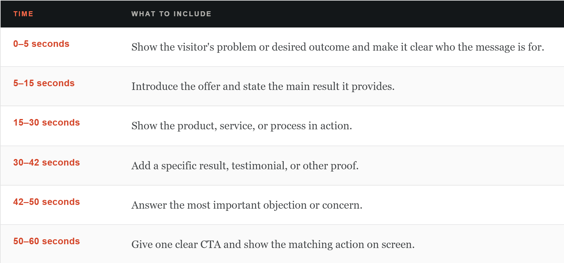
Image credit: Peakbound.studio
Measure Whether the Video Helps People Act
Views alone won't tell you if your video is actually helping your page. Look at play rate. Early drop-off. Completion rate. CTA clicks after viewing. Overall conversion rate.
And how it performs on mobile specifically. A low play rate usually points to a weak thumbnail or bad placement. A sharp drop in the first few seconds almost always means your intro is taking too long.
Here's something worth remembering, too. When people finish the video but still don't act, the problem probably isn't the runtime. It's more likely the offer, the proof, or the CTA itself. So test the whole decision path. Don't just focus on how short you can make the video.
Key Takeaway
A strong landing page video starts with the visitor's situation. It explains the offer in plain English. It shows the change it creates. It backs that up with real proof, answers one honest concern, and ends with a specific next step. It should also work without sound, load fast, and show up wherever its message actually helps.
The goal was never to cram every fact about your business into one video. It's to give visitors just enough clarity and confidence to move forward. Need help shaping the message and structure before production begins? Get in touch and we'll plan a video around the questions your customers are actually asking.